Ichimoku charts have become a popular trading tool in Japan, not only with the equity market, but in the currency, bond, futures, commodity and options markets as well. The technique was published over 30 years ago but has only gained international attention within the 1990's.

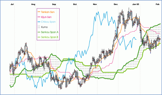
Figure 1. Definition of Ichimoku Kinko Hyo
Interpreting the Chart
Now that we have a chaotic chart filled with colorful lines and strange clouds, we need to know how to interpret it. The Ichimoku chart can be used to determine a variety of things. Here is a list of signals and how you can spot them:
- Strong signals - A strong buy signal occurs when the Tenkan-Sen crosses above the Kijun-Sen from below. A strong sell signal occurs when the opposite occurs. The signals must be above the Kumo.
- Normal signals - A normal buy signal occurs when the Tenkan-Sen crosses above the Kijun-Sen from below. A normal sell signal occurs when the opposite occurs. The signals must be within the Kumo.
- Weak signals - A weak buy signal occurs when the Tenkan-Sen crosses above the Kijun-Sen from below. A weak sell signal occurs when the opposite occurs. The signals must be below the Kumo.
- Overall strength - Strength is shown to be with the sellers if the Chikou Span is below the current price. Strength is shown to be with the buyers when the opposite is true.
- Support/resistance levels - Support and resistance levels are represented by the presence of the Kumo. If the price is entering the Kumo from below, then the price is at a resistance level. If the price is falling into the Kumo, then there is a support level.
- Trends - Trends can be determined by simply looking at where the current price is in relation to the Kumo. If the price stays below the Kumo, then there is a downward trend (bearish). Alternatively, if the price stays above the Kumo, then there is an upward trend (bullish).
As can be seen from the formulas, Ichimoku is very similar to moving average studies. And like moving averages, buy and sell signals are given with the crossover technique.
A bullish signal is issued when the Tenkan-Sen (orange line) crosses the Kijun-Sen (purple line) from below. Conversely, a bearish signal is issued when the Tenkan-Sen crosses the Kijun-Sen from above.
Moreover, there are, in fact, different levels of strengths for the buy and sell signals of an Ichimoku chart. First, if there was a bullish crossover signal and the price, at that time, was trading above the Kumo (or cloud), this would be considered a very strong buy signal. In contrast, if there was a bearish crossover signal and the price, at that time, was trading below the Kumo, this would be considered a very strong sell signal. Secondly, a normal buy or sell signal would be issued if the price was trading within the Kumo when the crossover took place. Thirdly, a weak buy signal would be issued if there was a bullish crossover that occurred while the price was trading below the Kumo. On the other hand, a weak signal would be issued if there was a bearish crossover that occurred when the price was trading above the Kumo.
Another striking feature of the Ichimoku charting technique is the identification of support and resistance levels. These levels can be predicted by the presence of the Kumo. The Kumo can also be used to help identify the prevailing trend of the market. If the price is above the Kumo, the prevailing trend is said to be up. And if the price is below the Kumo, the prevailing trend is said to be down.
A final feature of Ichimoku is the Chikou Span. This line can also be used to determine the strength of the buy or sell signal. If the Chikou Span was below the closing price and a sell signal was issued, then the strength is with the sellers, otherwise it is a weak signal. Conversely, if there was a buy signal and the Chikou Span was above the price, then there is strength to the upside, otherwise it can be considered a weak buy signal. This feature can also be incorporated into the other signals.
Application
Most traditional technical analysis techniques are based on the open, high, low, close or average price. Others may use volatility while fixed scales such as Fibonacci numbers have also been applied. But the results are the same. Support and resistance levels are always depicted as a point or a line.
With Ichimoku charts, it is the Kumo that quantifies support and resistance levels and the Kumo that can be used to project these levels into the future. It's therefore important to note that (unlike its traditional counterparts) the support/resistance level given by the Kumo appears as a layer of varying thickness, with the thickness being related to prior market volatility.
Let's now illustrate the Ichimoku technique with an example.

Figure 2. GBP/USD Daily Chart
Figure 2 is an Ichimoku daily chart of GBP/USD. As can be seen, the price was in a trading range for about two months between September and October 2004, trading below the Kumo which acted as a resistance level. A weak buy signal (one red up arrow) followed by a strong sell signal (three blue down arrows) and then another weak buy signal occurred during this period. After the last buy signal, the price subsequently pierced through the Kumo and an upside breakout followed.
Then in January 2005, the price retraced from its highs and traded within the Kumo for about a month without any direction. The price then surged back above the Kumo and as can be seen, the future support and resistance level from March 2005 onwards can be quantified. With Ichimoku theory, only when the price trades below this level can the uptrend be considered over.
Let's now combine Ichimoku with traditional support and resistance theory: previous highs and lows will act as support and/or resistance in the future.

Figure 3. USD/JPY Daily Chart
Figure 3 is an Ichimoku daily chart of USD/JPY. Between August and October 2004, the price was in a trading range within the Kumo, which acted as a support level. At point A, the price tested the bottom of the Kumo and this support level held. Afterwards, the price traded around this level before it surged temporarily higher but failed to create new highs. Soon after, the price retested the low (point B) made by point A. This coincided with a break below the Kumo which has since narrowed (i.e. lower volatility) and soon afterwards a huge downtrend commenced once the previous lows were taken out.
In general, the thickness of the Kumo can be related to strength of the current support/resistance level. A thin Kumo implies the current volatility of the market has lessened and the price has been narrowed into a range that a strong breakout to either side is imminent. On the other hand, a thick Kumo implies a strong support/resistance level coupled with high volatility.
Short-term/Long-term Implications
One might wonder then what implications Ichimoku has regarding short-term versus long-term trading. One general application is that by comparing a daily and a weekly chart, a price channel can be identified.
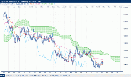
This can be illustrated with the USD/JPY weekly chart in Figure 4.

Figure 4. USD/JPY Weekly Chart
One can quickly observe that the price has been trading below the Kumo on a weekly basis for the past two and a half years. Comparing this with the daily chart in Figure 3, one can see that the price drop in October 2004 coincided with the price hitting a strong weekly resistance level.
So by comparing Ichimoku charts of different time frame, one can gauge where support and resistance levels exist and then better position oneself in the market.
This article only scratches the surface of this wonderful charting technique and as more charting applications provide this tool for traders, we believe that most traders will not want to trade without it.


0 comments:
Post a Comment